Damn you Brush Script!


An open letter to guitar makers across the world. For the love of all that is rock’n roll. Please stop this madness…
I’m the first to admit that I’m in awe of anyone who can make a guitar from scratch. I don’t mean bolt together some Warmoth parts and whack on a waterslide decal with “Wangcaster” on it. I mean get blocks of wood and shape them into something that resembles a playable instrument. It doesn’t even have to be that good a guitar… just the fact that you can do it blows me away. I’ll never be able to do it. It’s like trying to show a monkey how to use an iphone. He’ll pretend to understand but he’ll soon be back to scratching his ass in puzzlement and wonder. That’s me.
I understand the months it takes to properly prepare and dry the wood. I understand the weeks it takes to cut out the body and carve the neck. To get that perfect neck profile right. The precision it takes to get the frets installed and level. The painstaking process to get the beautiful finish of the body. So why, in Iommi’s name, after all that work do so many guitar luthiers insist on USING A SHITTY TYPEFACE LIKE BRUSH SCRIPT OR IT’S MANY VARIATIONS ON YOUR WORK OF ART?!

As a graphic designer, it’s my job to keep up with the latest typeface designs and keep up with current trends so that my clients work looks top notch. For me to use Brushscript, which is basically a free typeface that you get when you buy a crappy PC, is basically me telling my client that I think their product isn’t worth me spending more than 5 minutes on their project. It’s up there with Comic Sans. It’s the worst. THE WORST.
I’m guessing most of you mightn’t think it’s such a big deal. Well, here are some examples.
The earliest example I can find is the Califone by Murphy Guitars from the 60’s. They were sort of a Jazzmaster meets a Rickenbacker meets a Mosrite. I guess they chose Brushscript as it was a cheap Letraset typeface that looked similar to Fender’s CBS era black logo phase. Let’s move into the current era…

Here’s the headstock of Landcaster guitars. From what I can tell they’re very well made. They haven’t skimped anywhere… apart from bothering to getting a graphic designer to design them a decent logo. Nope, good ol’ Brushscript will do the job.

Next up, a very nice jazz guitar made by Doolin.
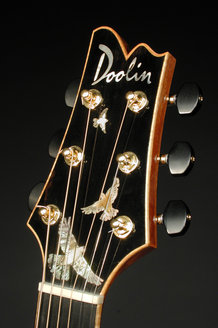
Again, this looks very well made. The detail on the dove inlays is very impressive. The choice of Brushscript less so.
Champtone guitars, as noted on their website “are built one at a time, with passion and enthusiasm.” YES, BUT YOU USE BRUSHSCRIPT SO ALL THAT EFFORT IS NULL AND VOID! Honestly, with a name like Champtone you could design a pretty sweet logo without resorting to using the dreaded BS.

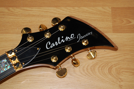
Carlino Guitars specialise in building guitars tat kind of look like a cross between an Ibanez Iceman and a Dean ML. Again, they look meticulously made. Oh look… BRUSHSCRIPT. THAT’S REALLY METAL, ISN’T IT?!
Van Der Haar Guitars are made in the Netherlands and they do the Fernder relic thing. Again not really cheap. But that headstock logo is.

And finally, the worst offender in my book. The guitar maker has absolutely no excuse using Brushscript. With his long history in guitar making and the resources behind him… this is just pure and honest laziness. After all, we’re talking about Grover Jackson. The guy who with Wayne Charvel developed the hot rodded Super Strat and started the pointy guitar craze. And this is his new logo?! Really, Grover?! After spending millions setting up your new company, this is what you came up with?

I could keep going and going but you get the point. Brushscript needs to be wiped out from headstocks around the world. It’s doing a disservice to the workmanship of the guitars that it sits on. They deserve better than this poor excuse for a typeface. JUST SAY NO TO BRUSHSCRIPT.
And to any of the guitar makers featured in this article. Please take no offense in my opinion of your choice of typeface. It has no bearing in what i think of the workmanship of your amazing guitars. But if you’d like me to have a crack at designing you a logo, please let me know.
Good to see another font and guitar nerd. GJ2 also has no excuse because it’s only three characters to design a logotype for.